Tableau has a super useful “Show Me” function which allows you to choose from 24 chart types based on dimensions and measures you select. This is a brilliant feature for beginners. However, what if you’re a little bit more experienced and want to know how to make these charts from scratch? Or even if you’re a beginner who doesn’t want a shortcut? In this four-part series, I will go through how to create all 24 “Show Me” chart types.
For this series, I will be using the “EU Superstore” dataset found in My Tableau Repository. In this post, I will go through how to create a text table, heat map, highlight table, symbol map, filled map and pie chart.
Let’s get started!
Text Table
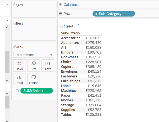
Text tables are exactly like they sound. A table of values similar to what you get in an Excel spreadsheet. For this text table, I would like to look at how much each sub-category of products have made in sales.
Step One
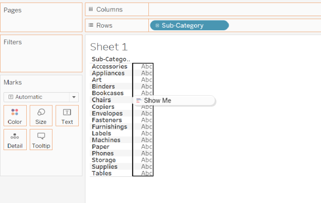
From the Data Pane, drag over the dimension “Sub-Category” over to the Rows Shelf (Figure 1).
Step Two
Next, drag the measure “Sales” from the Data Pane to the view, directly over the “Abc” letters (i.e. where you want the Sales values to go). When you see a black box and the words “Show Me”, release the Sales pill (Figure 1). You now have a text table (Figure 2)!
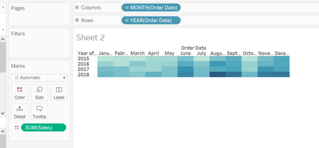
Heat Map
Real heat maps are not what Tableau defines as a heat map. Despite the name, are not maps but tables with the values shown on a colour scale. For this heat map, I would like to see which months across all the years in the data, have the greatest sales.
Step One
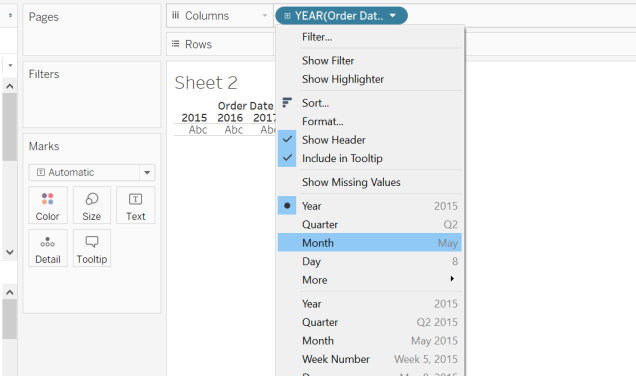
First, drag the dimension “Order Date” over to the Columns Shelf. The date will automatically be set to year but for the columns, we want to look at months. To change to months, right-click on the pill and select “Month” as shown in Figure 3.
Step Two
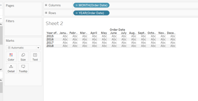
Next, drag “Order Date” from the Data Pane to the Rows Shelf. You should now have a text table without values, like in Figure 4.
Step Three
Finally, drag the measure “Sales” onto the Colour Shelf in the Marks Card. You will now have a heat map (Figure 5)! You can see that August 2018 has the best sales.
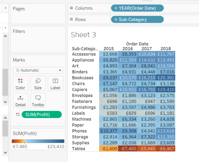
Highlight Table
Highlight tables are a cross between text tables and heat maps. For this highlight table, I would like to see how profitable each sub-category of products is for each year in this dataset.
Step One
Create a heat map using the same method as described earlier. In this case, you want Order Date in years on the Columns Shelf, Sub-Category on the Rows Shelf and Profit on the Colours Shelf in the Marks Card (Figure 6).
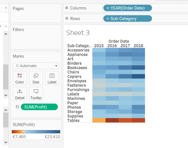
Step Two
Next, to turn this heat map into a highlight table, click on the Label Shelf and tick the box “Show mark labels”. Voila! You have a highlight table (Figure 7).
Symbol Map
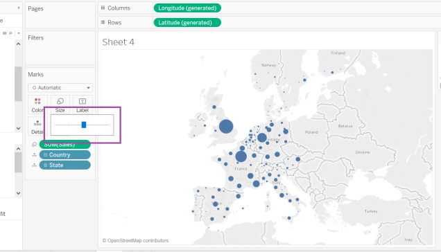
Maps in Tableau are created using geographical data (latitude and longitude). Symbol maps display information in relation to its location. For this symbol map, I would like to see how sales varies by state.
Step One
First, double click the dimension “State”. There will be a map with a dot for each state (Figure 8).
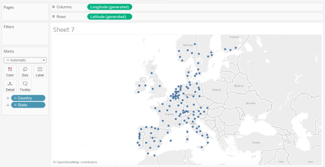
Step Two
To look at sales information, drag the measure “Sales” to the Size Shelf in the Marks Card. This will result in a map with the dots sized by sales (the bigger the dot, the greater the sales). As the dots look a little small, I increase the size of all the dots by using the slider on the Size Shelf (Figure 9) for greater impact. Now you have a symbol map!
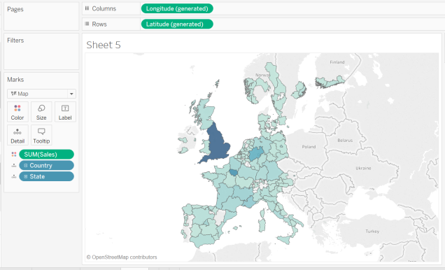
Filled Map
Tableau calls a filled map, “Maps”. However, we will call it a filled map to avoid confusion (plus I feel it’s a more accurate description). Filled maps are like symbol maps, but instead of dots sized by the measure selected, they map is coloured (i.e. filled in) by the measure. For this filled map, I will again be looking at how sales varies by state.
Step One
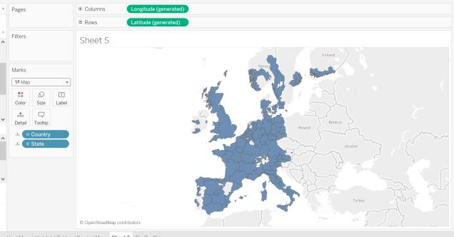
As in Step One for the symbol map, double click on the “State” dimension.
Step Two
To switch from a symbol map to a filled map, click on the drop-down menu in the Marks Card and select “Map”. The map will now be coloured in (Figure 10).
Step Three
Now, to add the sales information, drag the measure “Sales” to the Colour Shelf in the Marks Card. Ta-da! You have a filled map (Figure 11).
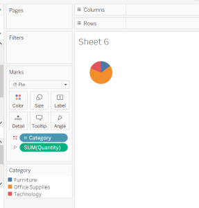
Pie Chart
The final chart for the first of this four-part series is the much used but much hated pie chart. Pie charts show dimension(s) as segments of a circle based on a measure. In this pie chart, I would like to know the quantity of product each category of product has sold.
Step One
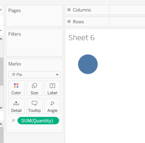
First, change the chart type to “Pie” in the drop-down menu within the Marks Card. A new shelf called “Angle” will appear in the Marks Card.
Step Two
Drag the measure “Quantity” to the Angle Shelf. This determines the angle of each segment in the pie chart. As there is only one segment currently, the pie chart in the view will show a single colour circle (Figure 12).
Step Three
To split the quantity into segments, drag the “Category” dimension to the Colour Shelf in the Marks Card. This will colour each of the values in Category. Now you have a pie chart (Figure 13)!
That’s it for part one! Congratulations on getting to the end of this long post. Stay tuned for part two, where we will go over bar charts, tree maps and circle views.
Happy vizzing!
Louise
Check out my blog feedmedata and follow me on @FeedMeData_
This post was also posted on thedataschool

2 thoughts on “Making Every “Show Me” Chart From Scratch: Part One”