Making Every “Show Me” Chart From Scratch: Part One

Tableau has a super useful “Show Me” function which allows you to choose from 24 chart types based on dimensions and measures you select. This is a brilliant feature for beginners. However, what if you’re a little bit more experienced and want to know how to make these charts from scratch? Or even if you’re a beginner who doesn’t want a shortcut? In this four-part series, I will go through how to create all 24 “Show Me” chart types.

For this series, I will be using the “EU Superstore” dataset found in My Tableau Repository. In this post, I will go through how to create a text table, heat map, highlight table, symbol map, filled map and pie chart.

Let’s get started!


Text Table

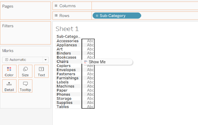
Text tables are exactly like they sound. A table of values similar to what you get in an Excel spreadsheet. For this text table, I would like to look at how much each sub-category of products have made in sales.


Step One

From the Data Pane, drag over the dimension “Sub-Category” over to the Rows Shelf (Figure 1).

Figure 1. Building a text table

Click to Keep Reading!

Avoid neglecting Alaska and Hawaii in your US maps

Why is Hawaii so far from the rest of the United States? Why is Canada in between Alaska and the rest of the United States?

Trying to get Alaska and Hawaii in a dashboard with the other 48 states can lead to lots of wasted, empty space (as seen in Figure 1). In this view, Alaska looks massive, with lots of space taken up by Canada to the right. Additionally, Hawaii is side-lined and mainland US is small with the details hard to see. Many times, Alaska and Hawaii are filtered out and disregarded completely in favour of a clear view of the remaining 48 states. However, doing this means leaving out potentially valuable information.

Figure 1. There is a lot of wasted space in the default view of the US maps

Is there a solution to this issue? Yes! In this blog post, I will go through a method I’ve used multiple times (Figure 2). Alaska, Hawaii and mainland USA are placed in three separate containers in a dashboard. Filters, highlighters, etc applied to one map will affect all three maps. This method eliminates much of the empty space between the lands and results in a functional and attractive way of representing all US states.

Click to Keep on Reading!