Tableau Tip: Stop Your Viz In Tooltips From Being Filtered

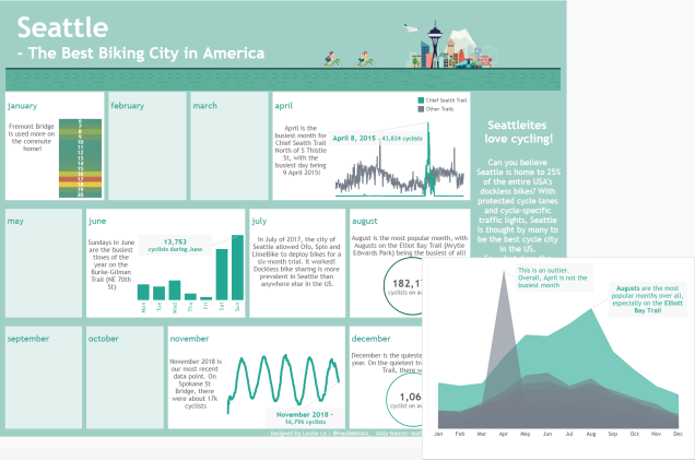
For Dashboard Week Day 4, we looked at Seattle cycling data (see my blog here). I decided to incorporate Viz in Tooltips to enhance my infographic (Tableau Public here) and give the reader more context (see Figure 1).

Now I don’t often use Viz in Tooltips because I’ve always had issues with filtering, this was again true for this viz. This issue is when the filters in the parent sheet applies to the tooltip sheet. I want my tooltip sheet to be static and unaffected by the filters in the parent sheet but for some reason, my tooltip sheet kept being filtered. In this post, I go over how to overcome this common Viz in Tooltip issue.


seattle tooltip
Fig 1. Viz in Tooltip in my Seattle cycling viz


Click to keep reading!

Dashboard Week Day 4 : Seattle, i.e. Cyclist Heaven

It’s day 4 of dashboard week and I am starting to fatigue. No matter! We push on.


The Challenge

Today’s dataset counts the number of cyclists riding through the roads of Seattle. Potentially very interesting for a Seattleite (/satellites) or a keen cyclist. For me, a person who learned to ride a bike at 12 and has hardly touched one since, it didn’t excite me. The data is as shown in Figure 1 below.


Fig 1. 1 cyclist, 5 cyclists, 2, 0, 2, 0, 0, 0, 0….


My Approach

Looking at this dataset didn’t immediately give me ideas (well.. besides a map. But I’ve overdone that). So I decided to make a colourful infographic-type viz to make the cycling data pop. I did a quick google search on cycling infographics for inspiration and came across this one:


Fig 2. My inspiration for today’s viz


Click to keep reading!

Dashboard Week Day 3 : Power BI for noobs

SPOILER ALERT: I like Power BI. Of course it has pros and cons, but overall, not too shabby.


Woah, we’re half way there! Woahhhhh!

It’s day 3 of Dashboard week which means we’re at the halfway point! See my viz from yesterday here.

Last night, Andy commented on Twitter that today’s project will be an ‘adventure’ (Figure 1). Immediate alarm bells!

Fig 1. Day 3 will be an adventure? Hmmmm that can’t be good.


And what an adventure it was.


Click to keep reading!

Dashboard Week Day 2: Everyone loves a pretty map

My first day of Dashboard Week! Yesterday the rest of DS11 enjoyed vizzing >200M rows of data about snow ploughing while I watched from home (hurray for a coincidental day of annual leave).


The Challenge

This morning I was rested and ready to take on the challenges of the week. Today, Andy set us the challenge of analysing New Orleans Police Department (NOPD) body-worn camera data. Now, this would have been super fun and interesting if there was information on the crime that was being recorded, whether this led to an arrest, etc.. but no. As you can see from Figure 1, the data contained information on the times body cams were used, where, how long each video is, when it was uploaded to the system… not exactly the juicy stuff.


Fig 1. What’s in this fascinating dataset?


Click to keep reading!

How to Approach a Time-Limited Project

At the Data School, we are constantly challenged and pushed with limited time projects. This is to develop our time management capabilities, to teach us to set realistic goals and to give us the confidence and knowledge that we can do it.

So, what have I learned? In this post, I will go over my top tips on how to approach a time-limited project.


Step One – Finding your Story

You have been inspired to start a project on a certain topic or you have been assigned a project by your employer. Where do you start? You have to find your story.

If your data has already been given to you, you can begin exploring the data. Identify the interesting parts of your data or find an issue you would like to investigate. Be careful not to spend too long exploring the data and deliberating on a story. Make note of what’s interesting and try to settle quickly on the story you would like to tell. I recommend writing down your story as it will help you keep to the topic and avoid wasting time by straying.

Click to keep reading!

Imposter Syndrome: Feeling like you belong

A reflective log and a message to current and future Data Schoolers…


Have you ever doubted your abilities?

Have you felt like you’re not as smart as people think you are?

Have you thought your accomplishments are due to luck?

Have you been afraid of being found out as a fraud?

Have you felt like you don’t fit?


This is Imposter Syndrome.


Click to keep reading!

How to Embed Spotify in your Vizzes

For my TIL Christmas Song viz in Figure 1 (see it here!), I embedded a Spotify playlist so you can listen to the music in the viz as you explore. Embedding a Spotify playlist/ track/ album can be great for adding another dimension to your vizzes. For example, they can supplement a viz about podcasts, movie soundtracks, or other musical topics.


Fig 1. The Colours of TIL’s Christmas


Doing this though, was not as easy as I expected. I expected a simple ‘copy playlist link’ from Spotify and paste into the Web Page object on Tableau Desktop (Figure 2) and boom! Embedded playlist. Nope.

Click here to keep reading!